Free Font Finder
Overview
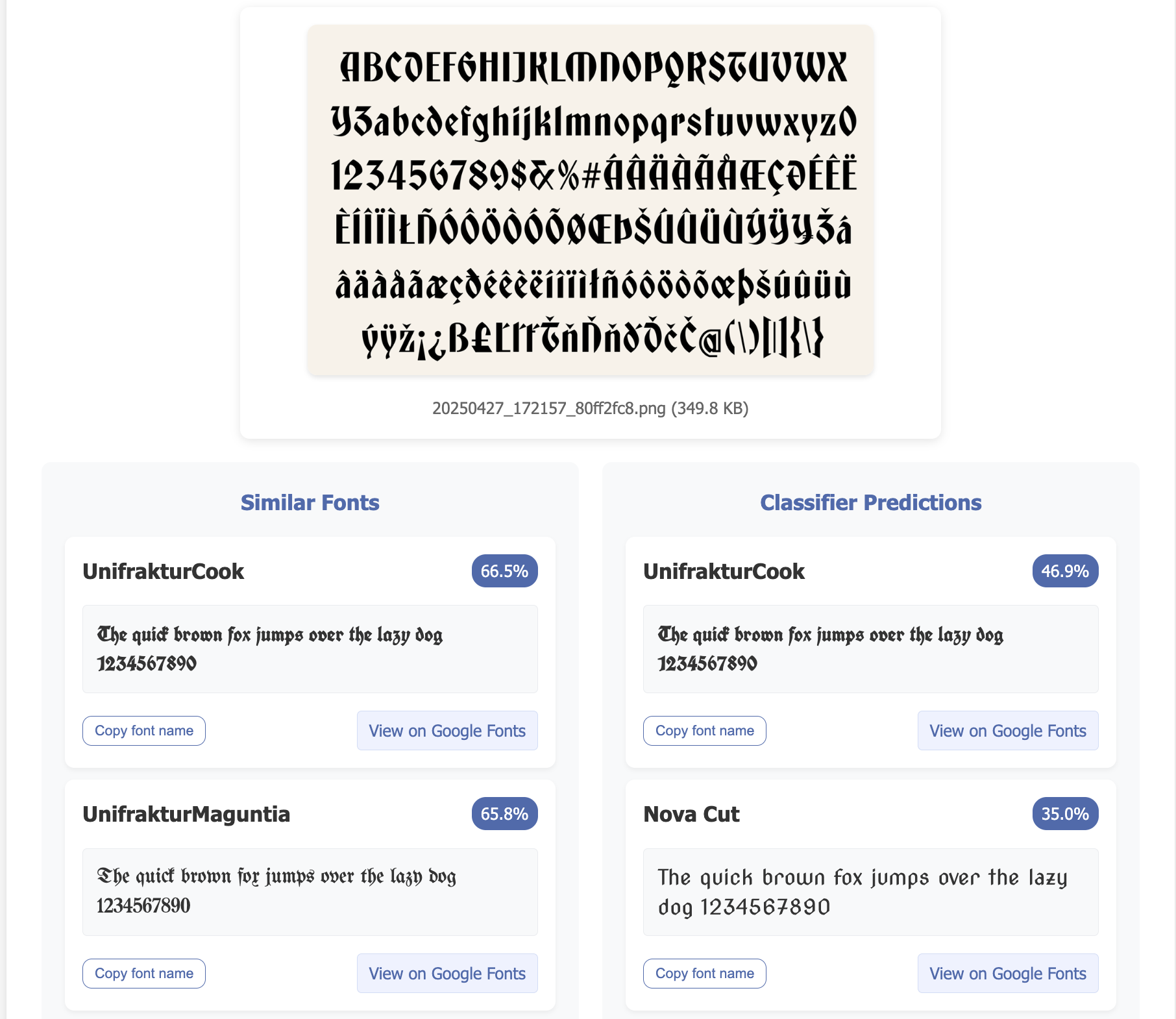
FreeFontFinder.com is a font recognition and similarity search tool that allows users to upload an image containing text and get back the most similar Google Fonts. It uses machine learning techniques to analyze the font characteristics and match them with the ~700 Google Fonts availble for free.
 |
|---|
| Sample image input and results for freefontfinder.com |
Why I built this
After looking for inspiration at other personal websites and digging for font names in the dev tools, I realized I didn’t want someone’s font directly. I just wanted a similar font ;) I chose Google fonts because it’s free and fairly comprehensive.
Machine learning seems like a good tool for the problem for a couple reasons.
First, we want our system to be able to distinguish the font regardless of what the content of the text is. There’s a pretty small number of alphanumeric characters, so covering the manifold in that sense is pretty straightforward if we can get it down to a character level problem.
Second, representation learning is perfect for recommendation. If a model learns the features that distinguish between fonts well enough, it should also be able to recommend similar fonts as long as the dimension of the embedding is not too large (since things become sparse in high dimensions and sparsity here means “similar” fonts could actually be pretty different).
Despite the fact that most of the fonts in existence are not literally in the dataset, there’s good reason to believe they are not out of distribution per se. Consider the space of features that actually comprise different fonts - serifs, slants and angles, ratios, ligatures, etc. It seems like there’s a pretty finite set of features that combine to make up fonts, therefore the odds that a font is completely out of distribution are pretty low. In other words, even if most of the fonts we see at inference are not literally members of classes in the training set, they are still hopefully somewhere meaningful in the hull of our feature space.
UPDATE This proved to be a bigger problem than I anticpated. See below in Manifold woes.
Why this is hard
I built this because none of the existing tools were satisfactory, and I had a pretty good time finding out exactly why.
Manifold woes
I underanticipated how similar so many fonts are, especially when the text size is small and the characters physically take up less space.
Another problem is that the font space is, by design, much bigger than the space I’m mapping. There are tens of thousands of fonts out there getting mapped down to the 700 that happen to be on Google. Sometimes that means that sometimes there is just not a similar font. The typical categorical cross-entropy classification loss assumes that every data point belong to one and only one class. In the real world, the opposite it most likely true! A font is most likely not a Google font! With that said, the next trouble I had was with overfitting.
Sim2real overfitting
In this regard, the prediction confidences were my north star, guiding me as to exactly how much I was overfitting. When testing on images I knew were not in the dataset, low prediction confidences were good indications. This brings me to one of my takeaways: there are two different types of “overfitting”.
There is overfitting on paper, the classic version where the train error is still going down but the test error is going up. Then there is sim2real overfitting, where the train and test errors are both going down but the model starts getting worse on the actual thing you care about, which the train and test datasets and just a proxy for.
How much one suspects sim2real overfitting should be inversely correlated to how well the train/test data actually cover the real manifold that model will be be seeing when deployed. In my case, even though the test loss was still going down, the best models according to my little test dataset tended to be the ones stopped a little earlier. This tracked pretty well with my knowledge that my train/test data was not representative of the real world, given I only had a few thousand datapoints per class and the images were all over the place in terms of font size, background, and contrast.
CRAFT OCR Model Peculiarities and Particularities
There were some tradeoffs with CRAFT, like whether its better to cut off some parts of the character but have cleaner patches, or to get the whole character with more potential for overlap. I also notice that the character patches tended to be biased to the right, so I added some custom padding by hand based on the size of the patch. I had a handful of user uploaded images that were all over the board in terms of text size, font, background, contrast, etc, which I used to fine tune the hyperparameters in CRAFT.
In Retrospect
Data Generation: I should have used the BelVal text generator instead of doing everything from scratch. This is rediculous but when I started initially, I was rendering the text onto HTML pages and using Selenium to screenshot the text and scroll. Eventually I wanted to add some backgrounds over the images to help regularize and I pretty much ended up recreating my own little version of the the Keras OCR data generation library. If nothing else, it was fun to have complete and total control over the data generation process and see how things like tweaking the background jitter or text size range affects the model.
Sequence averaging: I tried doing a naive average over the features from each character patches for a while. That didn’t work well when there were non-standard charcters of say-half cut off characters, which happened more frequently than I’d hoped. I’d tuned the CRAFT paramters pretty hard by this point, so short of fine tuning the CRAFT nonmax suppression myself, slapping a little 4-head transformer-based architecture on there to do a weighted average of the character patches was the next best thing. AIAYK IG
Technical Overview
See the readme on github for more details on the technical implementation. https://github.com/timholds/font-familiarity
Misc
It was hard to get the super weird fonts to work reliably, partly because CRAFT gives weird patches. To speculate further, I think its also because the weird fonts are further apart from each other way out on the tails of feature space, whereas the regular looking fonts are closer to each other. This means that a weird font going in can get a super different recommendation which can be quite jarring.
Zipf sampling: Thinking about covering the range of characters, I could either choose to sample them uniformly or with some other heuristic. I could sample them according to their frequency in the English language. I crafted a large text file to sample from by asking LLMs to write all sorts of different styles of text with the explicit instruction (sometimes) to include multiple instance of every alphanumeric character. That said, I’m pretty sure I’m undersampling uppercase letters.
Contrastive Learning:
Classifying the character identity was not a direct goal, but I’d have to think the model would need to learn to distinguish at least some of the more ambiguous and thus discriminative characters, like “l” and “I”. Getting character identities so that we can compare apples to apples for a contrastive loss was too expensive model latency wise. However, in the future it would be nice to try and use of some of the font metadata to at least help the serifs end up closer to the serifs, etc.